 In this video, we will describe the difference between Area Under the Curve (AUC) and receiver Operating Characteristic (ROC) Curves.
 ROC Curve is a metric that assesses the model ability to distinguish between binary (0 or 1) classes.
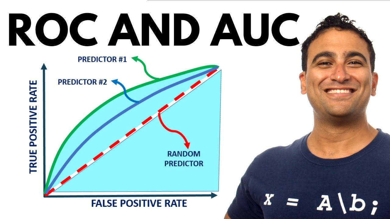
The ROC curve is created by plotting the true positive rate (TPR) against the false positive rate (FPR) at various threshold settings.
The true-positive rate is also known as sensitivity, recall or probability of detection in machine learning.
The false-positive rate is also known as the probability of false alarm and can be calculated as (1 − specificity).
Points above the diagonal line represent good classification (better than random)
The model performance improves if it becomes skewed towards the upper left corner.
The light blue area represents the area Under the Curve of the Receiver Operating Characteristic (AUROC).
The diagonal dashed red line represents the ROC curve of a random predictor with AUROC of 0.5.
If ROC AUC = 1, this means that we have a perfect classifier
Higher the AUC, the better the model is at predicting 0s as 0s and 1s as 1s.
I hope you guys enjoyed this video.
Please subscribe to my channel for more videos and see you next week.
Thanks and Happy Learning!
#ROC #AUC #ReceiverOperatingCharacteristic #AreaUnderCurve


0 Comments